Excelでベルカーブチャートテンプレートを作成するには?
ベルカーブチャートは、統計学では正規分布またはガウス分布とも呼ばれ、ほとんどの値が平均値の周囲に集まり、異なる結果の確率を強調するデータ分布を示すために広く使用されるグラフです。この曲線の最高点は、最も可能性の高いイベントを表します。このようなチャートは、品質管理、試験成績分析、ビジネスパフォーマンス評価などの分野で一般的に使用されており、観測された値の分布とその発生確率を直感的に視覚化できます。この記事では、Excelを使用して独自のデータセットでベルカーブチャートを作成する手順を説明し、さらにこの設定を再利用可能なチャートテンプレートとして保存する方法についても案内します。
Excelでベルカーブチャートを作成し、チャートテンプレートとして保存
Excelでベルカーブを作成するのは複数のステップが必要ですが、一度セットアップすれば、さまざまなデータセットに対応するようにチャートをカスタマイズしたり、将来の使用のためにデザインを保存することができます。この方法では、データ、計算方法、視覚的な書式設定に対して完全な制御を持つことができ、詳細なデータ分析のために精密かつカスタマイズ可能なチャートが必要な場合に理想的です。
利点: 最大限の柔軟性があり、すべてのステップが学習やドキュメント化の目的で明確に確認できます。
欠点: 手動での計算ステップや数式に対する注意深い取り扱いが必要です。
以下の詳細なステップに従ってください:
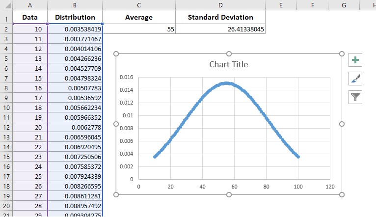
1新しいExcelワークブックを開き、範囲A1:D1にスクリーンショットのように列ヘッダーを作成します。推奨されるヘッダーは次の通りです: データ, 分布, 平均, 標準偏差.

2"データ"列の下に元の数字を入力します。ベルカーブの見た目を最適にするため、データは広範囲をカバーし、十分な数(少なくとも30~50個の値を推奨)である必要があります。今回の例では、A2:A92に10から100までの値を入力します。
データが最小から最大へ整列されていることを確認するために、列A内の数値が入ったセルを選択し、 データ > A から Z で並べ替えをクリックします。これにより、プロットされる曲線が正しく形成されます。
3. 補助統計量を計算する:
(1) セルC2に、データセットの算術平均(平均)を計算する次の数式を入力します:
この関数は選択した範囲の平均を取ります。範囲が実際のデータに一致していることを確認するか、必要に応じて調整してください。
(2) セルD2で、ベルカーブの幅を形成するために使用される標準偏差を計算します:
注:最近のExcelバージョンでは、サンプル標準偏差には =STDEV.S() が推奨されています。
(3) B2で、各データポイントの確率分布を生成します。Excelのバージョンに応じて、次のいずれかの数式を使用します:
A. Excel 2010以降の場合: =NORM.DIST(A2,$C$2,$D$2,FALSE) | B. Excel 2007の場合: =NORMDIST(A2,$C$2,$D$2,FALSE) |
適切な数式をセルB2に入力します。次に、オートフィルハンドルをドラッグしてすべてのデータ行(この例ではB92まで)に数式を適用します。これにより、各元のデータポイントに対応する分布(ベルカーブ)値が作成されます。
注意:データセットが異なる範囲をカバーしている場合は、すべての数式のセル参照を更新してください。また、数式の誤りは範囲やセル配置の不備によることが多いので、参照を慎重に確認してください。

4. データ列と分布列(例:範囲A2:B92)を選択します。挿入 > 散布図(またはExcel 2013以降の散布図およびドーナツチャート) > 平滑線とマーカー付き散布図に移動します。このチャートタイプはベル形状パターンを視覚化するのに最適です。

これで、次の例のようなベルカーブがチャートに表示されます:
明瞭さと美しさのために、グリッド線、軸ラベル、または凡例などの不要なチャート要素を削除してベル形状を強調することをお勧めします。削除したい要素を右クリックし、「削除」を選択するか、チャートの書式設定オプションからチェックを外します。
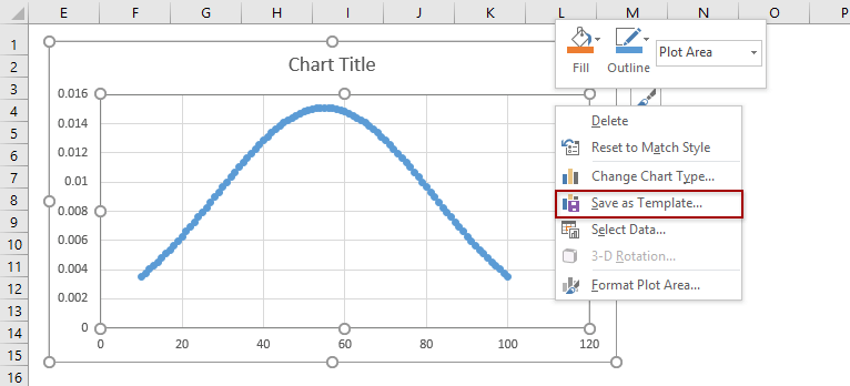
他のデータでこのチャートを再利用するには、それをテンプレートとして保存する必要があります:
5. ベルカーブをチャートテンプレートとして保存:
A. Excel 2013以降の場合:完成したベルカーブチャートを右クリックし、メニューから テンプレートとして保存 を選択します。
B. Excel 2007/2010の場合:チャートをクリックして チャートツール有効にし、次に デザイン > 名前を付けて保存.
これにより、将来別のデータセットで新しいベルカーブを簡単に作成でき、すべての書式設定を繰り返す必要がありません。
6. 「チャートテンプレートの保存」ダイアログが表示されたら、ファイル名フィールドに認識しやすい名前を指定します(例えば、「BellCurveTemplate」)、そして ファイル名 フィールド(例: "BellCurveTemplate")に記載し、 保存をクリックします。このテンプレートは、通常新規ワークブックのチャート選択ダイアログでアクセスできるデフォルトの「Templates」フォルダに保存されます。

トラブルシューティングのヒント:
- テンプレート保存オプションが利用できない場合、チャートが選択されていることと、デフォルトのテンプレートフォルダにファイルを書き込む適切な権限があることを確認してください。
- 将来のチャートがあなたが保存したベルカーブに似ていない場合は、入力データの完全性と正しい書式設定を再度確認してください。
驚きのツールでベルカーブを迅速に作成
手動での計算や複雑な数式を回避したい場合、Kutools for Excelは、数回のクリックでプロフェッショナルな見た目のベルカーブチャートを作成する正規分布/ベルカーブ機能を提供します。この方法は特に、不慣れなデータを扱う場合や、Excel関数の深い知識なしにすぐに統計的なビジュアルが必要な場合に価値があります。
利点: ベルカーブやコンボチャートを作成する時間とスキルを大幅に削減します。頻度ヒストグラムやコンボチャートなど、より包括的な分析を行うための追加オプションが含まれています。
欠点: Kutools for Excelのインストールが必要です。
1. データ値を含む範囲を選択します。最適な結果を得るためには、データが数値であり、空白セルやテキストを含まないことを確認してください。 Kutools > チャート > データ分布 > 正規分布 / ベルカーブ をクリックします。
2. 表示されるダイアログボックスで、 正規分布チャート オプションを 選択 セクションで選びます。 OK をクリックしてチャートを作成します。

このダイアログでは、以下を設定できます:
(1) 必要に応じて、チャートタイトルを直接入力してラベル付けを行います。
(2) 頻度ヒストグラムのみをチェックすることで、 頻度ヒストグラムチャート.
(3) ヒストグラムとベルカーブを一つの視覚的表現に組み合わせるには、 選択.
両方のオプションをチェックします。 正規分布チャート オプションのみが選択された場合:

両方の 正規分布チャート および 頻度ヒストグラムチャート がコメディ効果のためにチェックされた場合:

注意事項:
- データ範囲には妥当な数値エントリーのみを含めてください。
- 結果のチャートが期待通りに表示されない場合、データエラーまたは範囲の不一致を確認してください。
手動での解決策と比較すると、特にレポートやプレゼンテーション用のチャートを最小限の努力で生成する場合、Kutools for Excelを使用することは迅速で一貫性のある結果を得るために理想的です。
VBA: マクロを使用して自動的にベルカーブを生成する
高度なユーザーまたは反復的なレポートを自動化する対象者にとって、単純なVBAマクロはユーザー定義のパラメーターからベルカーブデータを迅速に生成し、自動的にグラフをプロットできます。これは、変更するデータを扱う場合や、一貫した形式を必要とする頻繁なレポートに特に役立ちます。
利点: 計算とチャート作成の両方を自動化できます。バッチ処理に適しています。
欠点: マクロに関するある程度の知識が必要で、VBAスクリプトを実行するにはセキュリティ許可が必要な場合があります。
- データを準備します。 すでにデータセットがある場合(例:範囲A2:A92)、Excelの数式を使用して平均、標準偏差、範囲の開始/終了を計算します:平均を取得:
=AVERAGE(A2:A92)標準偏差を取得:=STDEV.P(A2:A92)範囲の開始を取得:=Mean-3*Standard Deviation平均がB2にあり、標準偏差がC2にある場合、この数式は次のようになります: =B2-3*C2範囲の終了を取得:=Mean+3*Standard Deviation平均がB2にあり、標準偏差がC2にある場合、この数式は次のようになります: =B2+3*C2ステップについては、1または0.1を使用します。ステップ値が小さいほど、曲線は滑らかになります。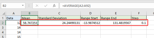
- コードを実行する
- Alt + F11 を押してVBAエディタを開きます。
- 新しいモジュールを挿入し、GenerateBellCurveマクロコードを貼り付けます。
Sub GenerateBellCurve() 'Updated by Extendoffice 2025/07/24 Dim xMean As Double Dim xStdev As Double Dim xStart As Double Dim xEnd As Double Dim xStep As Double Dim xRow As Integer Dim ws As Worksheet Dim chartObj As ChartObject Dim xValue As Double On Error Resume Next xTitleId = "KutoolsforExcel" Set ws = Worksheets.Add ws.Name = "BellCurve" xMean = Application.InputBox("Enter mean value:", xTitleId, 50, Type:=1) xStdev = Application.InputBox("Enter standard deviation:", xTitleId, 10, Type:=1) xStart = Application.InputBox("Enter range start (e.g. 10):", xTitleId, xMean - 3 * xStdev, Type:=1) xEnd = Application.InputBox("Enter range end (e.g. 100):", xTitleId, xMean + 3 * xStdev, Type:=1) xStep = Application.InputBox("Enter step interval (e.g. 1):", xTitleId, 1, Type:=1) ws.Range("A1:B1").Value = Array("X", "Normal Distribution") xRow = 2 For xValue = xStart To xEnd Step xStep ws.Cells(xRow, 1).Value = xValue ws.Cells(xRow, 2).Value = WorksheetFunction.Norm_Dist(xValue, xMean, xStdev, False) xRow = xRow + 1 Next Set chartObj = ws.ChartObjects.Add(Left:=300, Width:=500, Top:=10, Height:=300) With chartObj.Chart .ChartType = xlXYScatterSmooth .SetSourceData Source:=ws.Range("A1:B" & xRow - 1) .HasTitle = True .ChartTitle.Text = "Bell Curve" .Axes(xlCategory).HasTitle = True .Axes(xlCategory).AxisTitle.Text = "X" .Axes(xlValue).HasTitle = True .Axes(xlValue).AxisTitle.Text = "Probability Density" End With ws.Activate End Sub - F5 を押してマクロを実行します。
- プロンプト時に必要な値を入力する マクロは次の項目を要求します:
- 平均値:計算した平均値が入っているセルを選択します。覚えていれば、手動で値を入力することもできます。
- 標準偏差:標準偏差が入っているセルを選択します。
- 範囲の開始:範囲の開始が入っているセルを選択します。
- 範囲の終了:範囲の終了が入っているセルを選択します。
- ステップ:1または0.1を入力します。または、ステップ値が入っているセルを選択します。

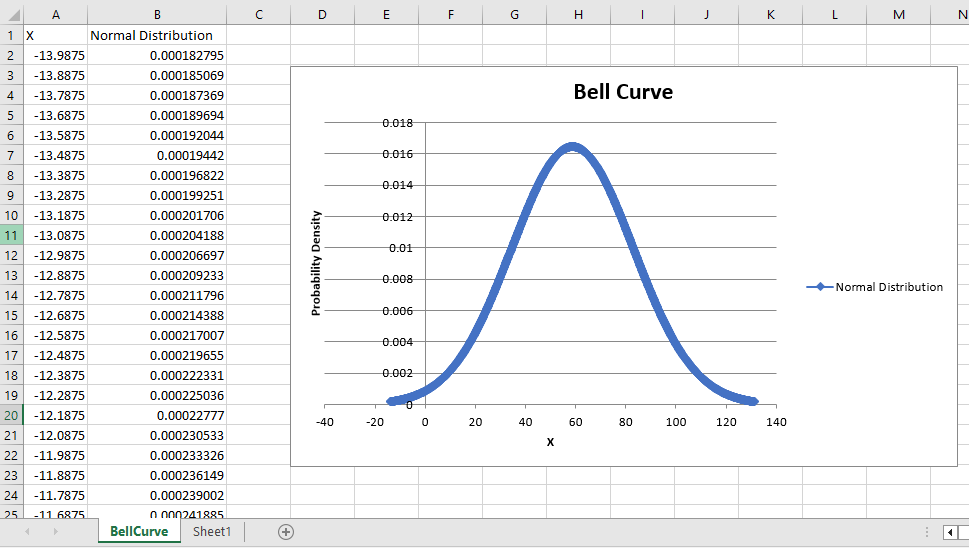
完了すると、新しいワークシート名「BellCurve」が作成されます。
- 列AにはX軸の値(データ範囲)が含まれます。
- 列BにはNORM.DIST()を使用して計算された確率密度値が含まれます。
- 平滑な散布図(ベルカーブ)がワークシートに直接挿入されます。

ヒント:エラーが発生した場合、パラメーターの入力を再確認し、ワークシートやチャートを追加するための権限があることを確認してください。マクロは元に戻せないことがあるため、VBAスクリプトを実行する前に必ず作業内容を保存してください。
関連記事

ExcelでチャートのX軸を負の値/ゼロ/下部に移動する
ソースデータに負のデータが存在する場合、チャートのX軸はチャートの中央に位置します。見栄えを良くするため、一部のユーザーはX軸を負のラベルの下、ゼロの下、またはチャートの最下部に移動したいと考えることがあります。

Excelでチャートに水平平均線を追加する
Excelでは、データの傾向を分析するためにチャートを作成することがよくありますが、時には、プロットされたデータの平均線を表す水平線をチャートに追加し、データの平均値を明確かつ容易に確認できるようにしたい場合があります。

Excelでチャート軸を分割する
ソースデータに非常に大きいまたは小さい系列/ポイントがある場合、小さな系列/ポイントはチャート上で十分に正確に表示されないことがあります。このような場合、一部のユーザーは軸を分割し、小さな系列と大きな系列の両方を同時に正確に表示したいと考えることがあります。
最高のオフィス業務効率化ツール
| 🤖 | Kutools AI Aide:データ分析を革新します。主な機能:Intelligent Execution|コード生成|カスタム数式の作成|データの分析とグラフの生成|Kutools Functionsの呼び出し…… |
| 人気の機能:重複の検索・ハイライト・重複をマーキング|空白行を削除|データを失わずに列またはセルを統合|丸める…… | |
| スーパーLOOKUP:複数条件でのVLookup|複数値でのVLookup|複数シートの検索|ファジーマッチ…… | |
| 高度なドロップダウンリスト:ドロップダウンリストを素早く作成|連動ドロップダウンリスト|複数選択ドロップダウンリスト…… | |
| 列マネージャー:指定した数の列を追加 |列の移動 |非表示列の表示/非表示の切替| 範囲&列の比較…… | |
| 注目の機能:グリッドフォーカス|デザインビュー|強化された数式バー|ワークブック&ワークシートの管理|オートテキスト ライブラリ|日付ピッカー|データの統合 |セルの暗号化/復号化|リストで電子メールを送信|スーパーフィルター|特殊フィルタ(太字/斜体/取り消し線などをフィルター)…… | |
| トップ15ツールセット:12 種類のテキストツール(テキストの追加、特定の文字を削除など)|50種類以上のグラフ(ガントチャートなど)|40種類以上の便利な数式(誕生日に基づいて年齢を計算するなど)|19 種類の挿入ツール(QRコードの挿入、パスから画像の挿入など)|12 種類の変換ツール(単語に変換する、通貨変換など)|7種の統合&分割ツール(高度な行のマージ、セルの分割など)|… その他多数 |
Kutools for ExcelでExcelスキルを強化し、これまでにない効率を体感しましょう。 Kutools for Excelは300以上の高度な機能で生産性向上と保存時間を実現します。最も必要な機能はこちらをクリック...
Office TabでOfficeにタブインターフェースを追加し、作業をもっと簡単に
- Word、Excel、PowerPointでタブによる編集・閲覧を実現。
- 新しいウィンドウを開かず、同じウィンドウの新しいタブで複数のドキュメントを開いたり作成できます。
- 生産性が50%向上し、毎日のマウスクリック数を何百回も削減!
全てのKutoolsアドインを一つのインストーラーで
Kutools for Officeスイートは、Excel、Word、Outlook、PowerPoint用アドインとOffice Tab Proをまとめて提供。Officeアプリを横断して働くチームに最適です。
- オールインワンスイート — Excel、Word、Outlook、PowerPoint用アドインとOffice Tab Proが含まれます
- 1つのインストーラー・1つのライセンス —— 数分でセットアップ完了(MSI対応)
- 一括管理でより効率的 —— Officeアプリ間で快適な生産性を発揮
- 30日間フル機能お試し —— 登録やクレジットカード不要
- コストパフォーマンス最適 —— 個別購入よりお得