Excel で棒グラフの幅を広くするには、縦棒グラフをどのように調整すればよいでしょうか?
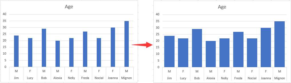
この記事では、以下のスクリーンショットのように、Excel で縦棒グラフのすべての棒の幅を広くする方法を説明します。
Excel で棒グラフの幅を広くするために縦棒グラフを調整する
Excel で棒グラフの幅を広くするために縦棒グラフを調整する
縦棒グラフの棒の幅を広げるには、以下の手順に従ってください。
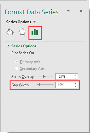
1。縦棒グラフ内の任意の棒をクリックして右クリックし、コンテキストメニューからデータ系列の書式設定を選択してください。スクリーンショットをご確認ください。
![右クリックメニューから[データ系列の書式設定]を選択](http://cdn.extendoffice.com/images/stories/doc-excel/doc-make-bar-wider/doc-make-bar-wider-2.png)
2。「データ系列の書式設定」ペインが表示されたら、「ズーム」バーにある「間隔の幅」を左にドラッグし、「系列のオプション」セクションで棒グラフの幅がお好みのサイズになるまで調整してください。スクリーンショットをご確認ください。
3。「データ系列の書式設定」ペインを閉じてください。
すると、指定した縦棒グラフ内の棒の幅が、以下のスクリーンショットのように広がっていることが確認できます。

KUTOOLS AI でExcel の魔法を解き放ちましょう
- スマート実行:セル操作、データ分析、チャート作成をすべてシンプルなコマンドで実現します。
- カスタム数式:ワークフローの効率化に役立つ、あなただけのカスタマイズ数式を生成します。
- VBA コーディング:VBA コードを簡単に記述・実装できます。
- 数式の解釈:複雑な数式が簡単に理解できます。
- テキスト翻訳:スプレッドシート内で言語の壁を乗り越えましょう!
AI 搭載のツールでExcel の機能をさらに強化しましょう。今すぐダウンロードして、これまでにない効率を体験してください!
最高の Office 業務効率化ツール
| 🤖 | KUTOOLS AI アシスタント:次に基づいてデータ分析を革新します:インテリジェント実行 | コード生成| カスタム数式作成 | データ分析とチャート生成| 拡張機能呼び出し… |
| 人気の機能:検索・ハイライト、または重複をマーキング | 空白行を削除する | データを失うことなく列の結合またはセルを | 数式を使用しない四捨五入... | |
| スーパー LOOKUP:複数条件 VLookup | 複数値 VLookup | 複数シート間 VLookup | ファジーマッチ.... | |
| 高度なドロップダウンリスト:ドロップダウンリストをすばやく作成 | 連動型ドロップダウンリスト | 複数選択可能なドロップダウンリスト.... | |
| 列マネージャー:指定した数の列を追加|列の移動|非表示列の表示状態を切り替え|範囲および列の比較... | |
| 注目の機能:グリッドフォーカス | デザインビュー |強化された数式バー | ワークブックとシートマネージャー | リソースライブラリ(オートテキスト)| 日付ピッカー | ワークシートの統合 | 暗号化/セルの復号化 | リストからメール送信 | スーパーフィルター | 特殊フィルタ(太字のフォントを持つセルをフィルタリング/斜体/取り消し線。。。) 。。。 | |
| トップ15 ツールセット:12 テキストツール(テキストの追加、特定の文字を削除、...)| 50+チャートタイプ(ガントチャート、...)| 40+実用的関数(誕生日に基づいて年齢を計算します、...)| 19 挿入ツール(QR コードを挿入、パスから画像を挿入、...)| 12 変換ツール(単語に変換する、為替レートの変換、...)| 7 結合と分割ツール(高度な行のマージ、セルの分割、...)|さらに多数 |
Kutools はお好みの言語でご利用いただけます。英語、スペイン語、ドイツ語、フランス語、中国語、および40+の他の言語をサポートしています!
Kutools for Excel でExcel スキルを強化し、これまでにない効率を体験しましょう。Kutools for Excel は、生産性を高め、時間を大幅に節約できる高度な機能を300 以上提供します。最も必要な機能を今すぐ入手するにはこちらをクリック。。。
Office Tab は Office にタブインターフェースをもたらし、作業を大幅に簡単にします
- Word、Excel、PowerPoint でタブを使った編集と閲覧を有効にします。Publisher、Access、Visio、Project でもご利用いただけます。
- 複数のドキュメントを、新しいウィンドウではなく、同じウィンドウ内の新しいタブで開いたり作成したりできます。
- 日々の生産性を50%も向上させ、毎日数百回ものマウスクリックを削減します!
すべてのKutools アドインが、たった1 つのインストーラーで完結。
Kutools for Officeスイートには、Excel ・Word ・Outlook ・PowerPoint 用のアドインと Office Tab Pro が含まれており、複数の Office アプリを横断して作業するチームに最適です。
- オールインワンスイート— Excel、Word、Outlook、PowerPoint 用アドイン+Office Tab Pro
- インストーラー1 つ、ライセンス1 つ— 数分でセットアップ可能(MSI 対応)
- 連携してさらにパワーアップ— Office アプリ全体で生産性が向上
- 30 日間のフル機能トライアル— 登録不要、クレジットカード不要
- 最高のお得感— 個別アドイン購入よりお得